ParkExcite
A Mobile Desgn for a Parking App (Case Study)

Introduction
Many frustrations arise when it comes to parking, especially in larger cities. The struggle to find a parking spot often leaves people feeling anxious, rushing to get to where they need to be, and arriving late when they do finally reach their destination.
ParkExcite was created to :
alleviate parking-related stresses
transform parking into a positive experience

Project Details
I am the sole creator of ParkExcite. No teams or stakeholders were involved in the process. The project took a few months due to the high level of detail and amount of work I put in. No budget was required, as it is a concept design rather than an actual product.
Design tools: Figma, InVision
Research —> Ideate —> Define —> Design —> Prototype —> Test
The Problem

People are having bad experiences with parking.
As I looked deeper into this, I saw that there are several factors involved -
Time
Money
Convenience
Stress
Research
My research goals were to :
explore the core issues surrounding parking
complete interviews to understand the user base
condense data into maps and key points
Surveys & Interviews
Using the feedback from a survey that I sent out the potential user base, I conducted five interviews with selected participants to further define the problem.
The participants discussed their various parking experiences in detail, and I gained a clear image of what their problems were and how they were connected.
“It’s done two or three different ways here so you never know which way it is gonna be. Do I need to get a ticket and bring it back to the car? Do I need to just take my card up there? Punch in a license plate which I’ll only remember like half of the time? You know, that’s a pain!”
“Sometimes it’s not clear. You know how sometimes they paint the curbs? And then there’s a little sign on the meter for specific days you can’t park there or a certain time in that day that you can’t park, but you’re not completely sure because it says no parking. And then there’s all this extra stuff at the bottom, so I’m just like ok maybe I’ll just find some other space that doesn’t say no parking.”
Affinity Map

Empathy Map

User Persona
Key Insights
Overcrowding
It is a huge issue in major cities, and it leads to low parking availability. This is the main reason for frustration amongst users.
Signage
Users find signage hard to follow which leads to losing focus on the road, missing turns, and not understanding where or what time they can park.
Paying
Paying for parking can be tedious, albeit for various reasons. A streamlined payment method would make the process easier.
Meters
Users struggle with the reliability of meters and machines. Even if they do not mess up frequently, it is a huge inconvenience when they do.
Ideate
Once the problem was clearly identified, it was time to :
decide which features to include
map out the foundation of the app
create flows to showcase the user journey
User Stories
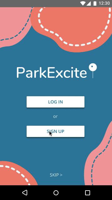
User Flows
Create an account
*Click to enlarge
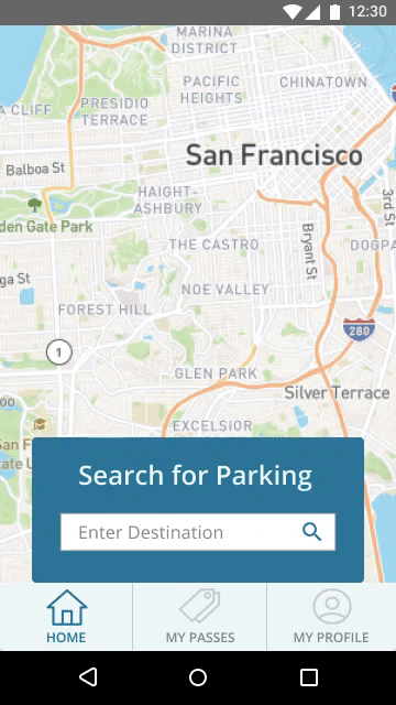
Search for and reserve parking
*Click to enlarge
Checkout
*Click to enlarge
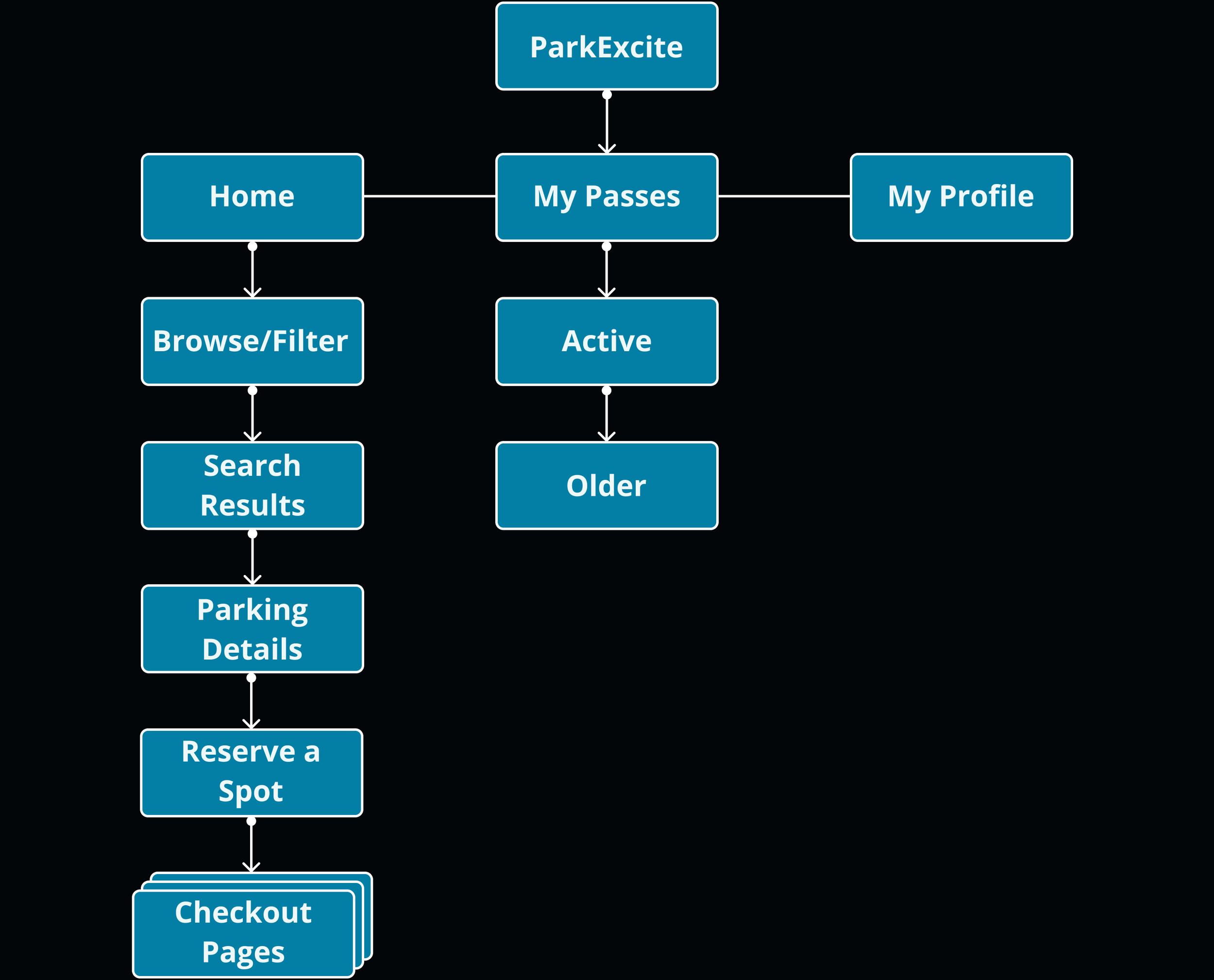
Site Map
Define
In order to define the product, I needed to :
draw sketches to serve as the early visual designs for the app
create wireframes in Figma based on those sketches
adopt branding and visual styles to give the product its own personality
Sketches
Wireframes
Branding & Visual Styles
Moodboard

Color Palette

Design
By incorporating the branding and visual styles from above., I finalized the design of the app. ParkExcite started to come to life and look more vibrant!
Clickable Prototype
I built a fully-functional prototype to test with users, and the testing process began.
Test
To see how the app would work in real life, I conducted usability testing in two rounds and fixed errors along the way after each test. There were ten participants and tests total.
Round One
Five users tested the app for the first round. The main issues were that certain buttons were not interactive, some visual design elements were not aligned, and information could be added or rearranged to make it easier to navigate.
“I’m trying to click on the “X” button, but it’s not letting me cancel my search”
Round Two
The next five users tested the app for the second round. During this round, I discovered that the map was not in high resolution, some elements were incorrectly linked, and improvements could be made to the filtering screen.
“I noticed the map is blurry compared to the rest of the images. Is there a reason for that or is it supposed to be as clear as the others?”
“I think it would be nice to include a “free” option for people who do not want to spend any money”
Final Solutions
Sign Up/Create an Account
Users can sign up for ParkExcite and create a profile
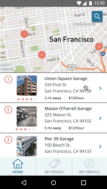
Search Filtering
Users are able to filter their search by date, distance, and price
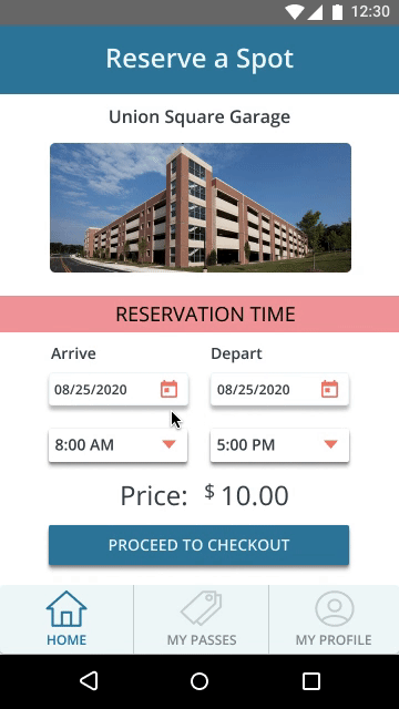
Reserve Parking
Users can reserve parking spots in advance
Purchase a Parking Pass
Users can buy a parking pass prior to arriving at their destination
Next Steps
Post-MVP Considerations
The app design currently meets the minimum requirements for the desired functionality. Extra features would need to be included to create a more fulfilling user experience. Always room to improve!
Collaborate with Developers
In order to make the app functional, a developer or team of developers would need to work off of my design and input code.
Additional User Testing
More testing is required to edit bug fixes and finalize the product, and this process will likely repeat many times. Maybe one day ParkExcite will be available on the market for everyone!